Cent Pages
This project marks my first experience in bringing a product from concept to reality—a pivotal step in developing my combined design and engineering approach. Here, I've created a refined version of the application to showcase the skills I've honed since the original. As such, the designs shown are not replicas of what exists on app.cent.co but represent my reimagined solution given the chance to design it again with a more refined approach.
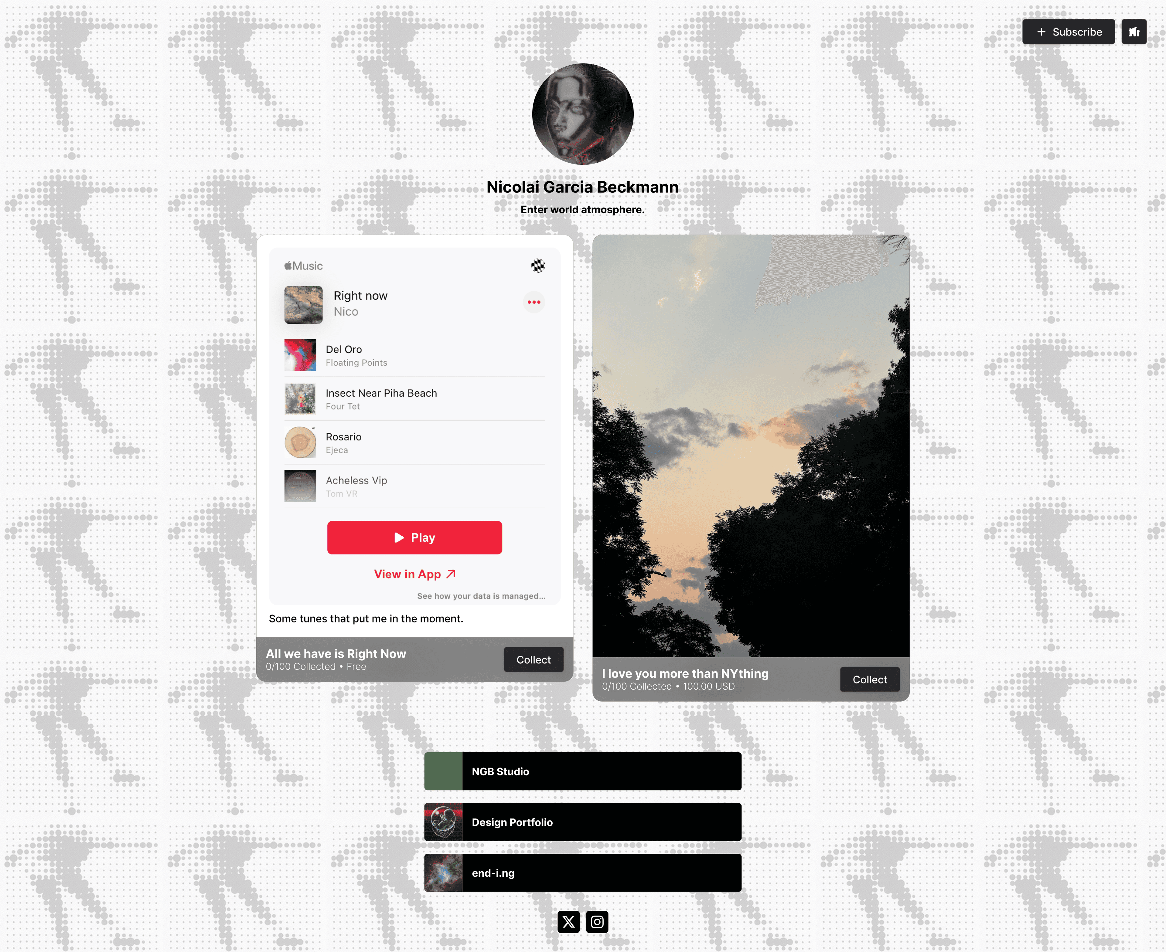
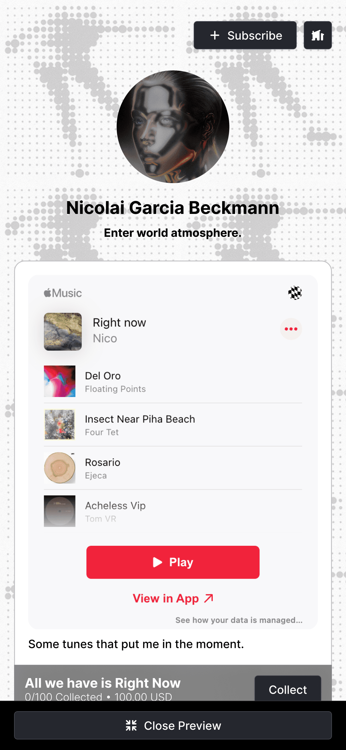
The idea behind Cent Pages was to bundle the commonly-understood “Link in bio” website with a sophisticated NFT creation and collection platform without requiring cryptocurrency wallets and assets. Like any link in bio platform, the page is fully customizable to match the creator’s visual aesthetic and presents links to where their persona exists online. It builds on top of this paradigm with the addition of a “Subscribe” button and a gallery of collectible posts. Users subscribe to a creator with their email address and, in return, are able to collect the available posts and are notified when new ones are created. This pattern seeks to improve the relationship between creator and audience. The creator gains a centralized email list of their fans across their various social media platforms while the fan gains a more meaningful way to support their favorite artists than likes and comments.
The product aims to lower the barrier to entry into the web3 creative space by providing accessible and comprehensible tools that leverage comprehensible tools that leverage NFT and blockchain technology while abstracting its complexity. To achieve this, the product employs familiar UI/UX paradigms and language.
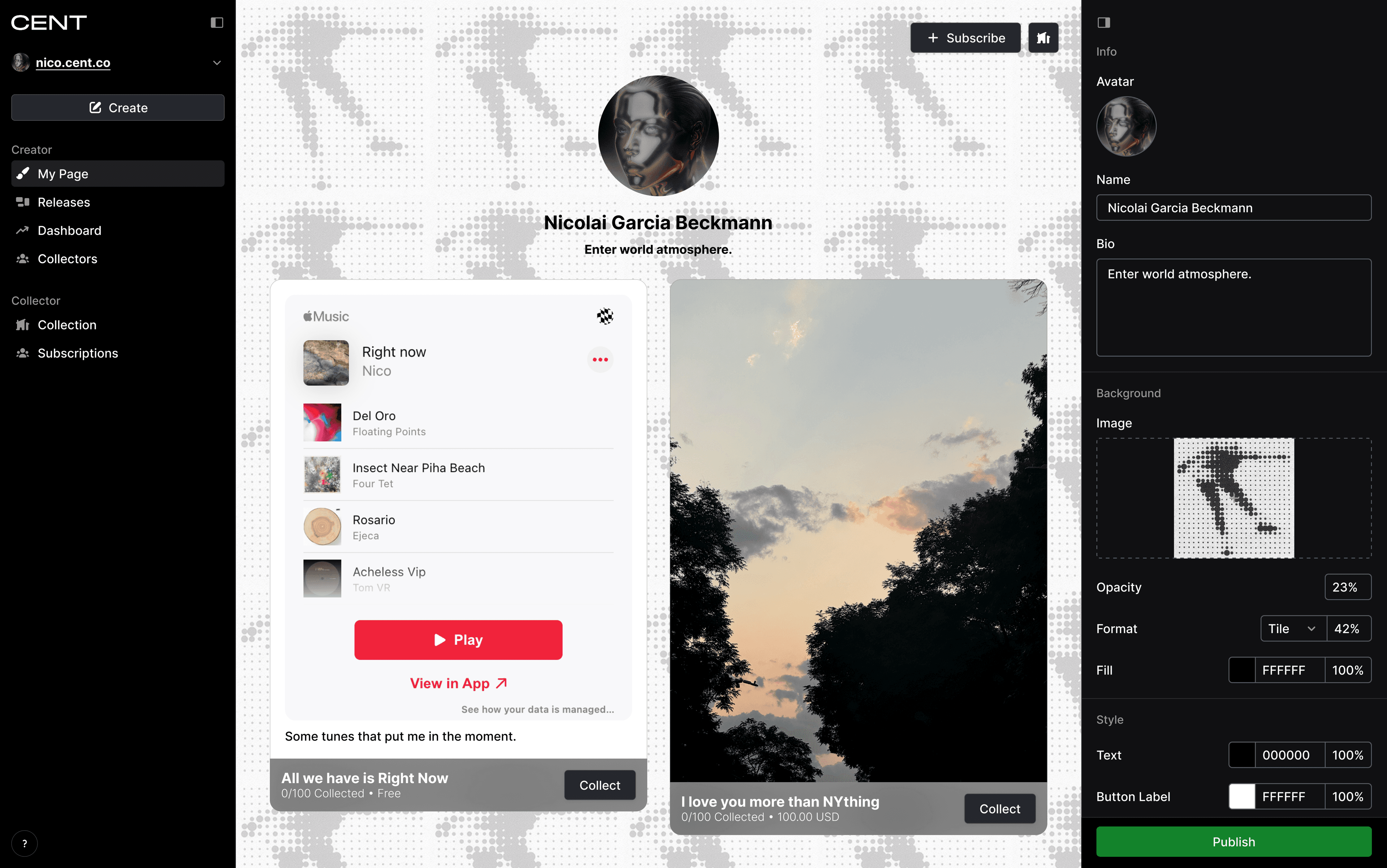
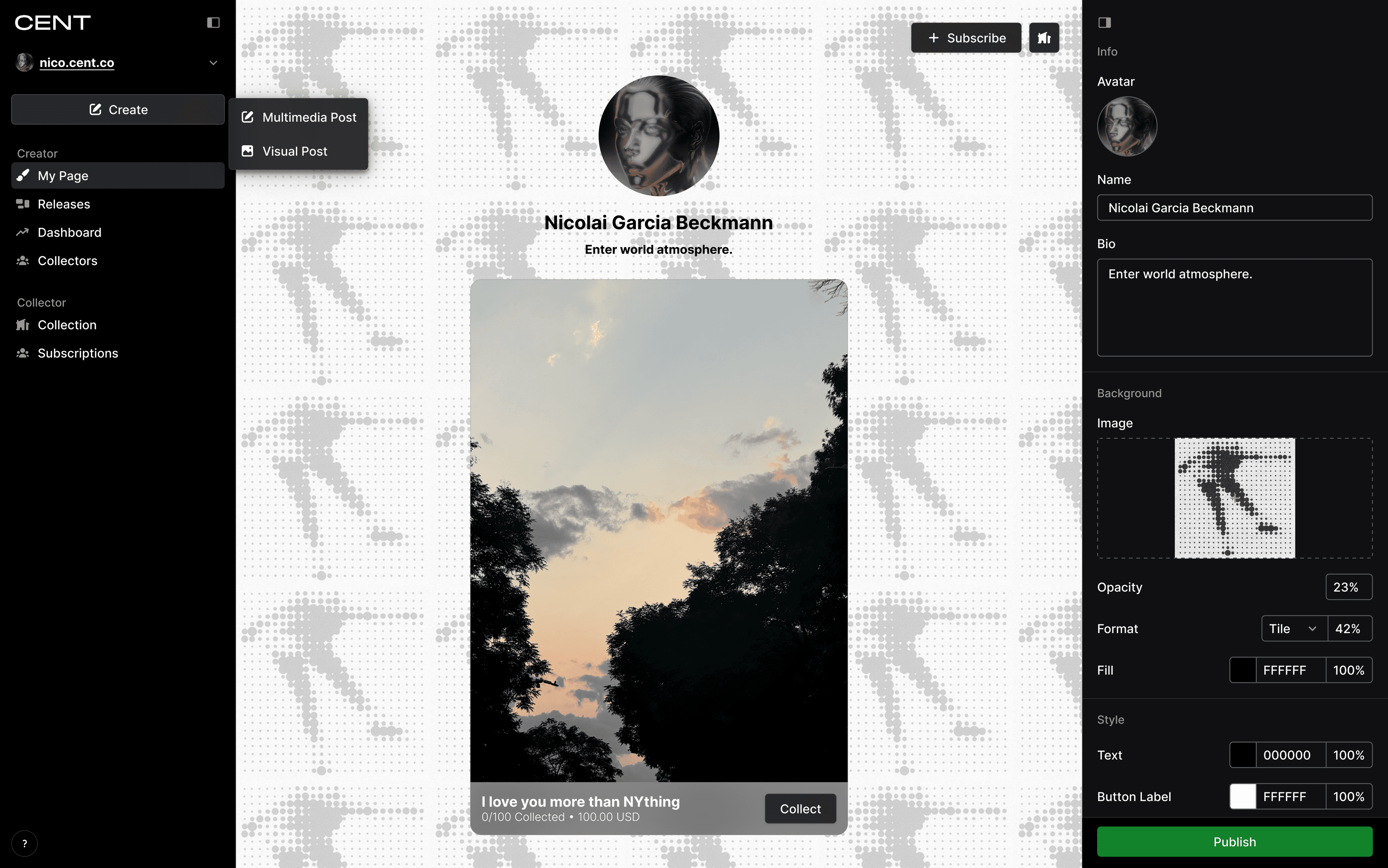
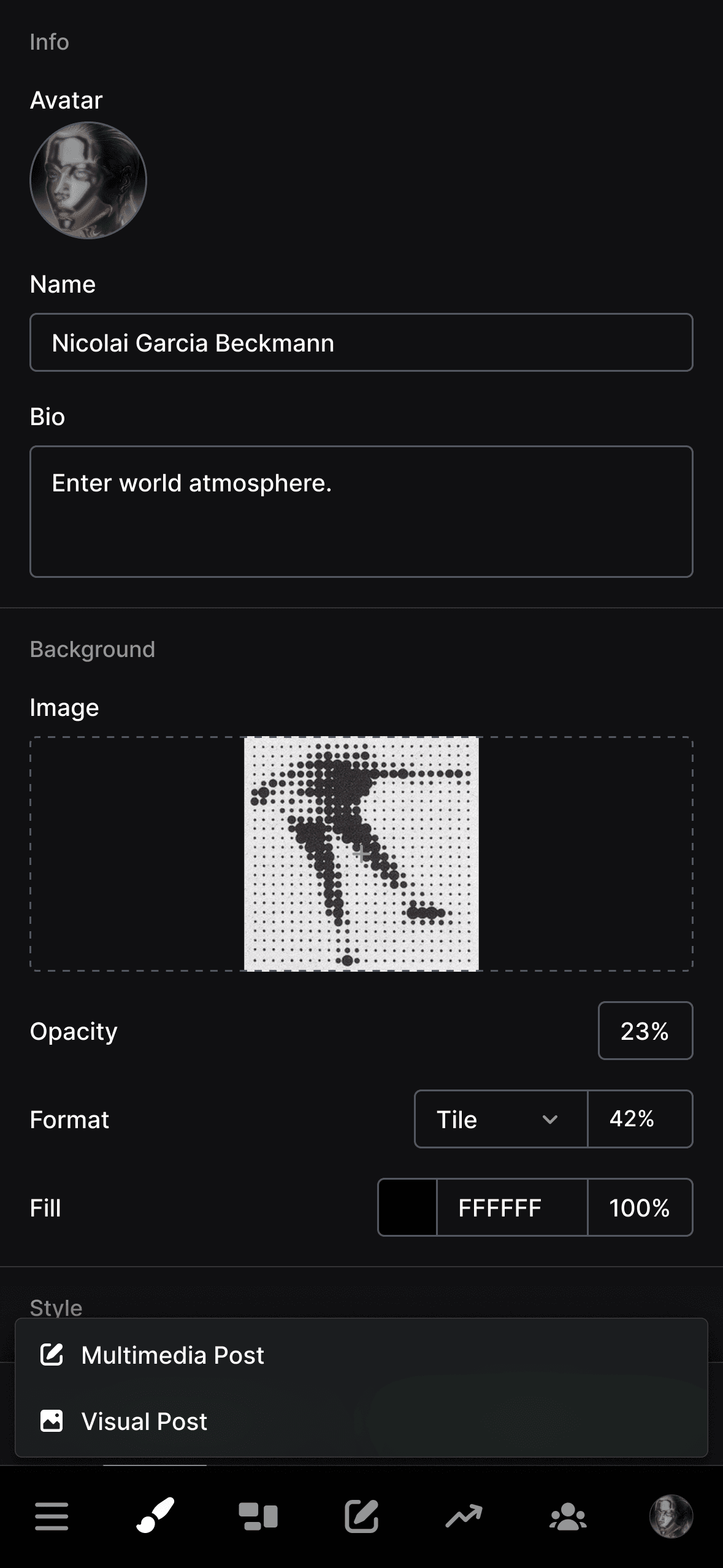
My Page
This view presents an editing interface for the creator's page. Following a similar pattern to Figma, Webflow, and other UI-building tools, it centers the page preview which takes up all available width and houses all customization inputs in a right-hand drawer.
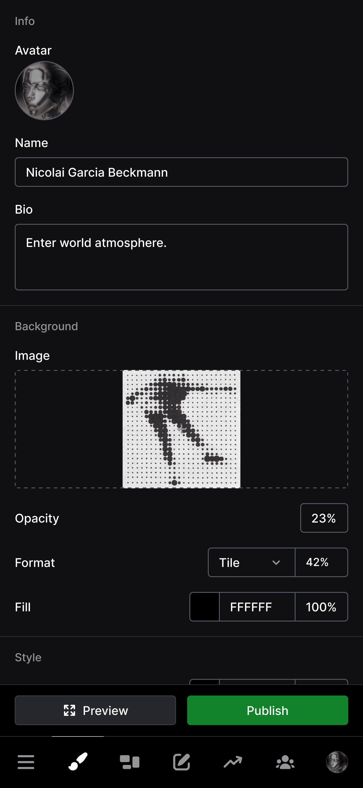
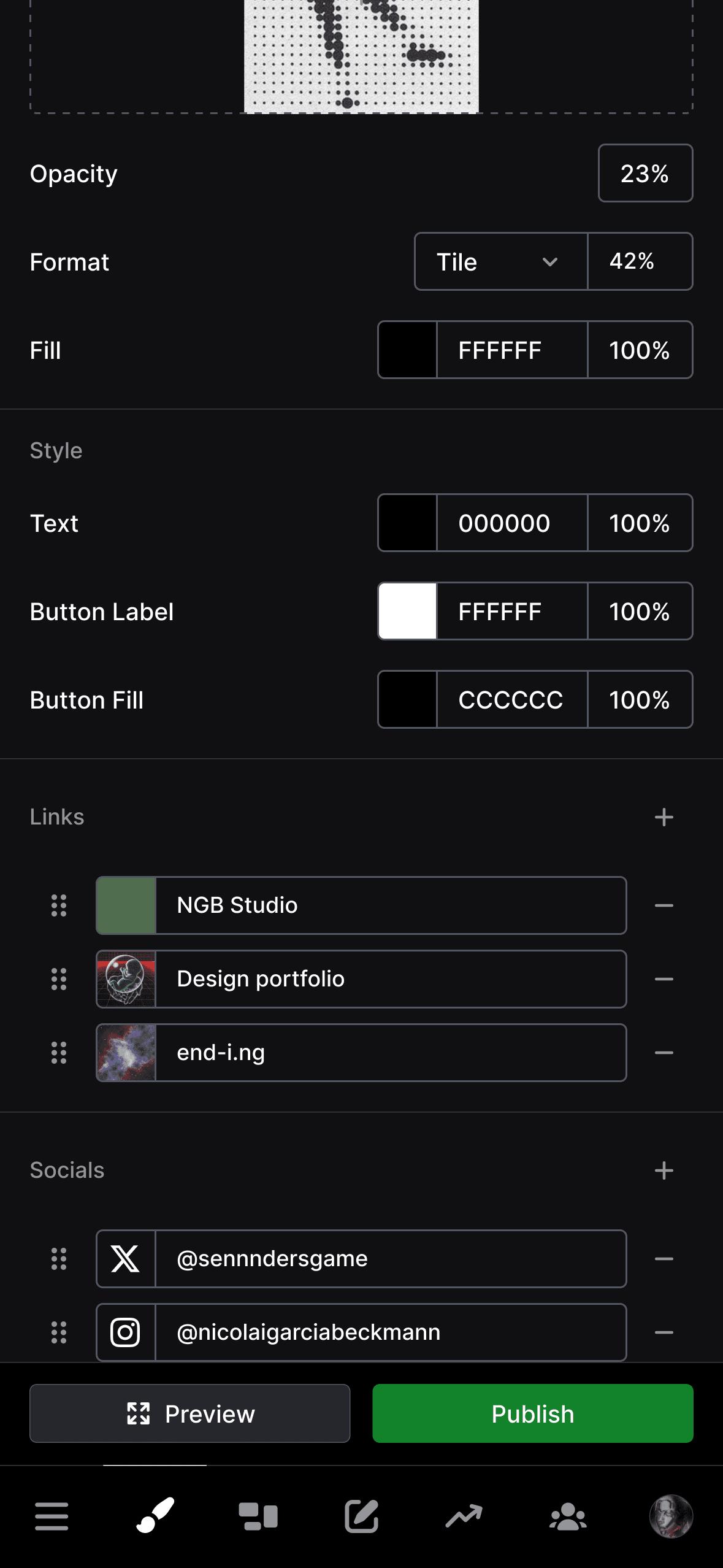
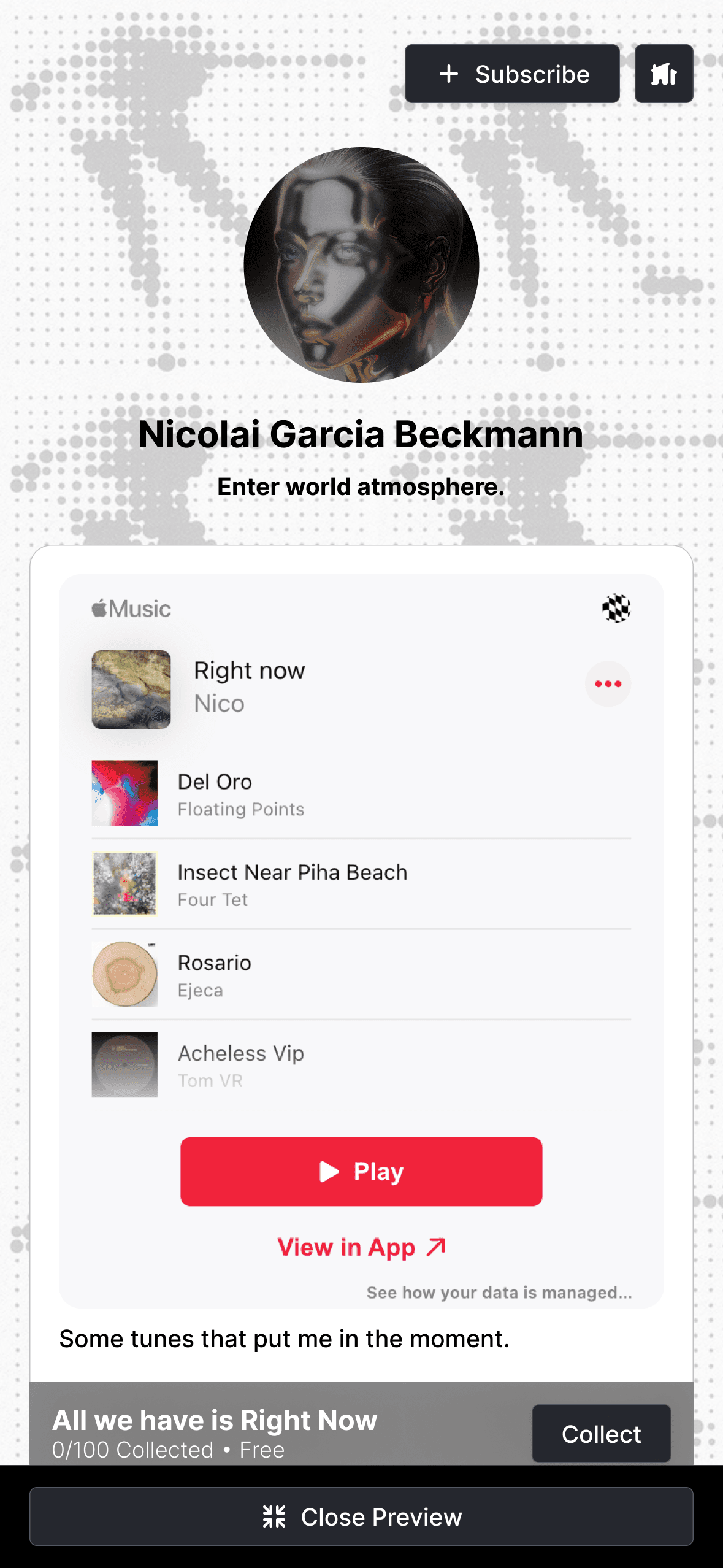
The view is responds to mobile screens by displaying the customization inputs as the main content of the page while adding a toggle button next to the primary publish CTA to present the page preview.
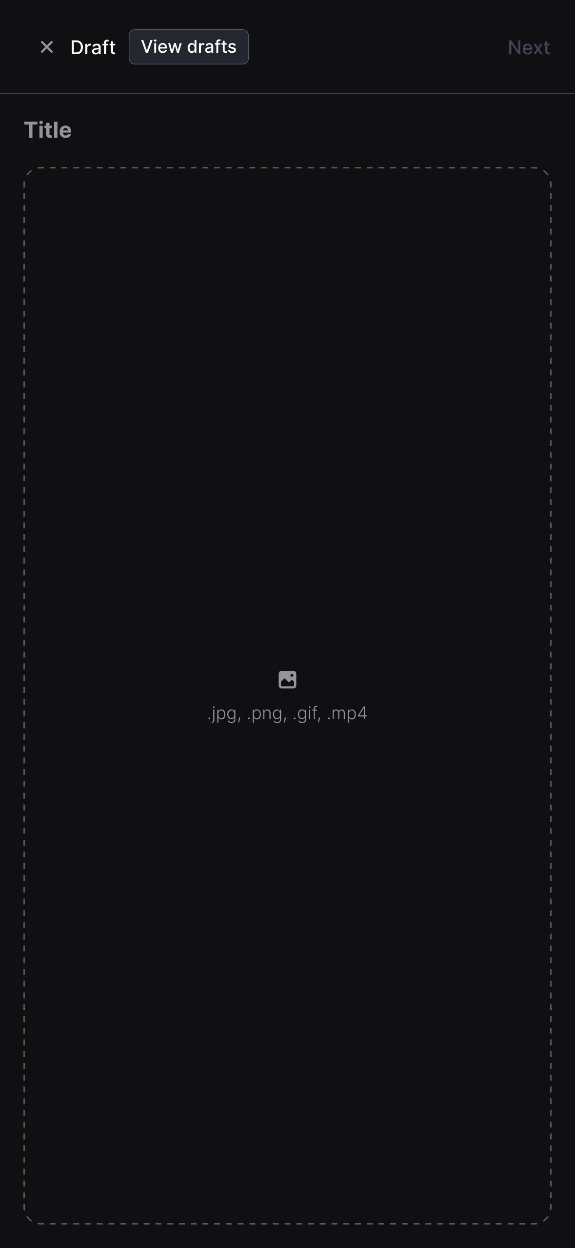
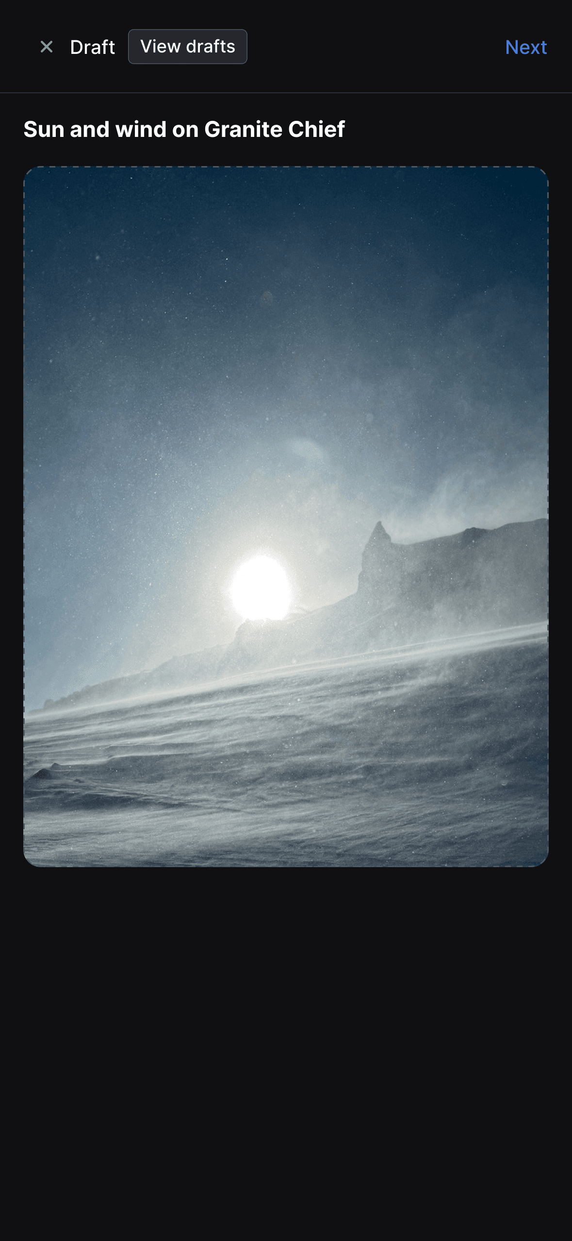
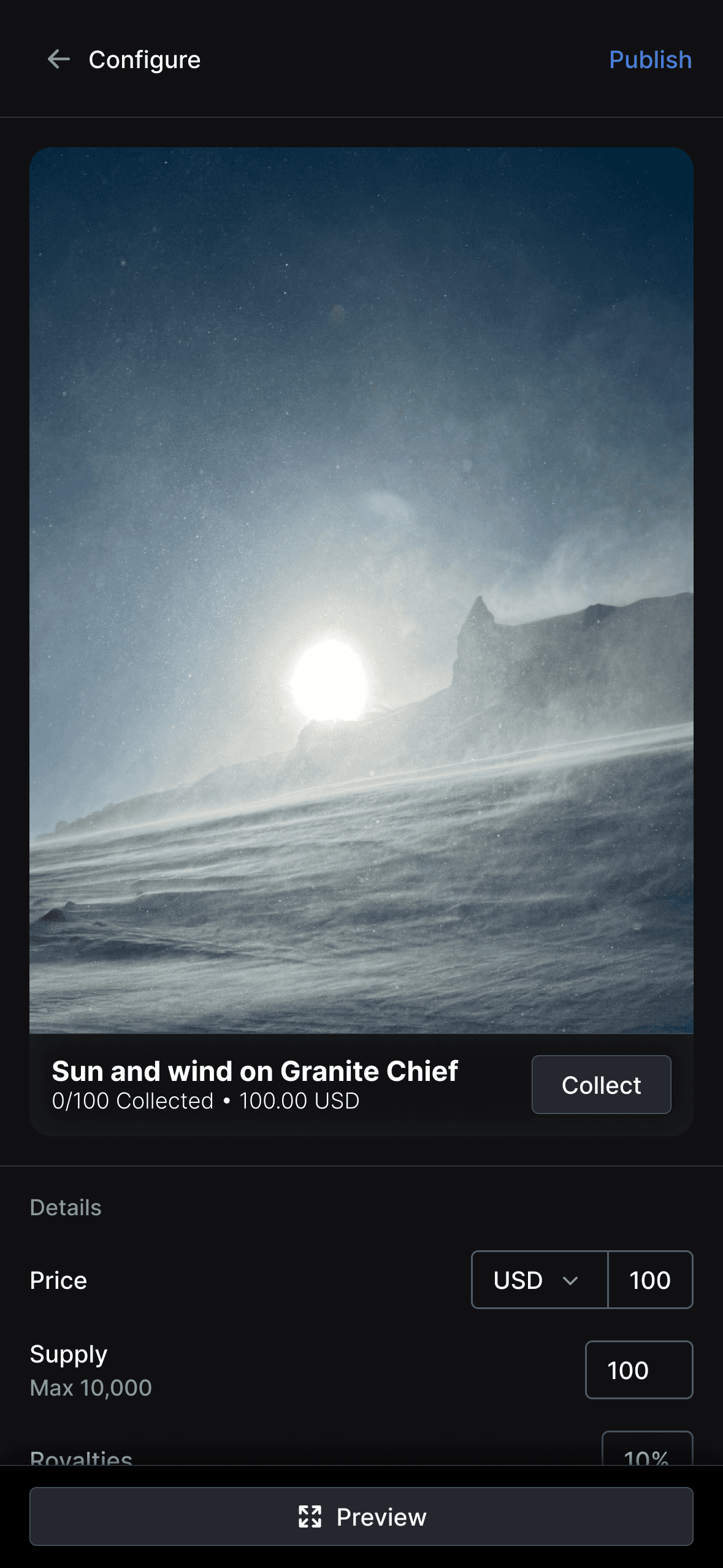
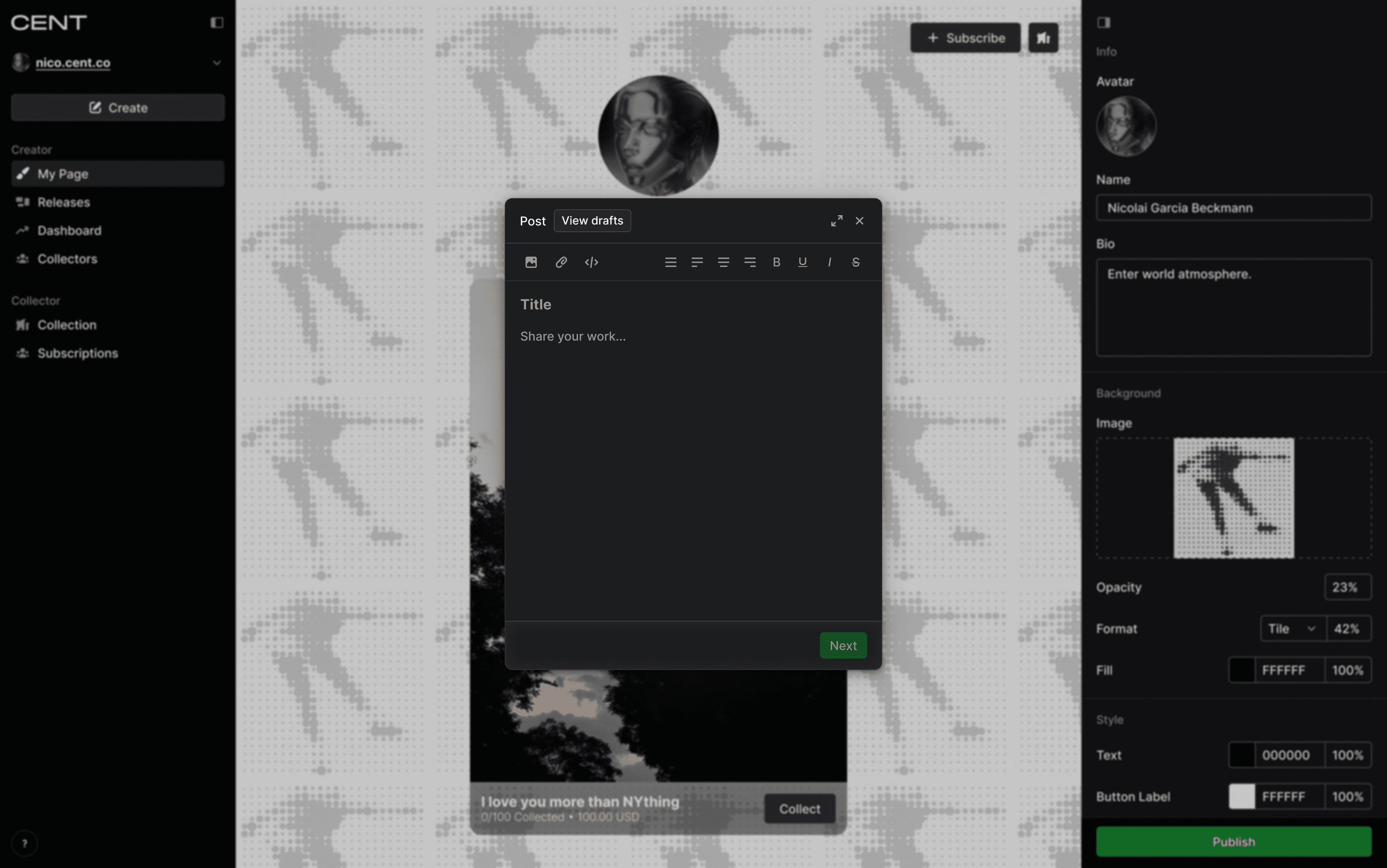
Create Post
There are two post types available to creators that require slightly different flows. Thus, the "Create" button presents a popup with these two options that will present the respective creation dialog.
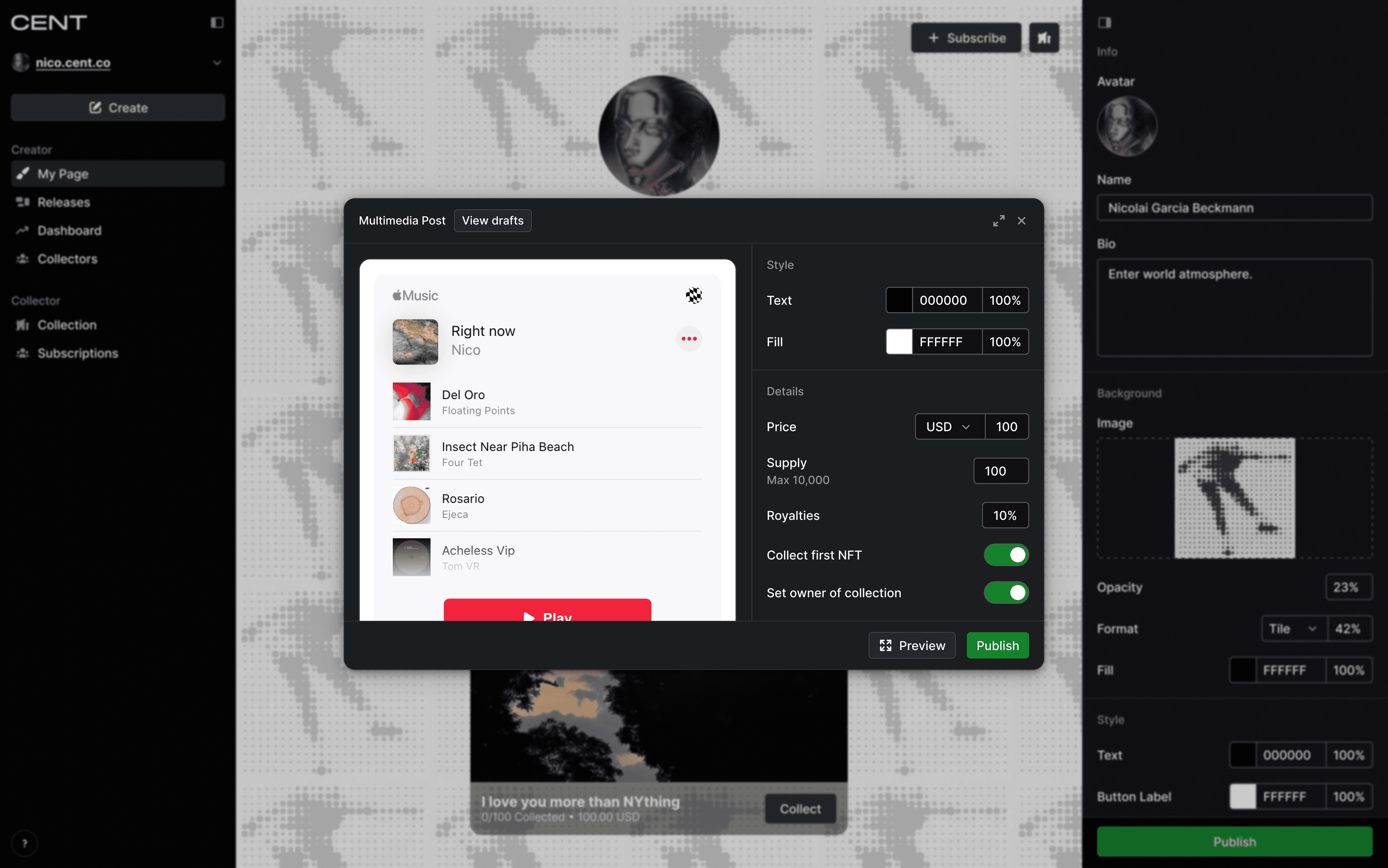
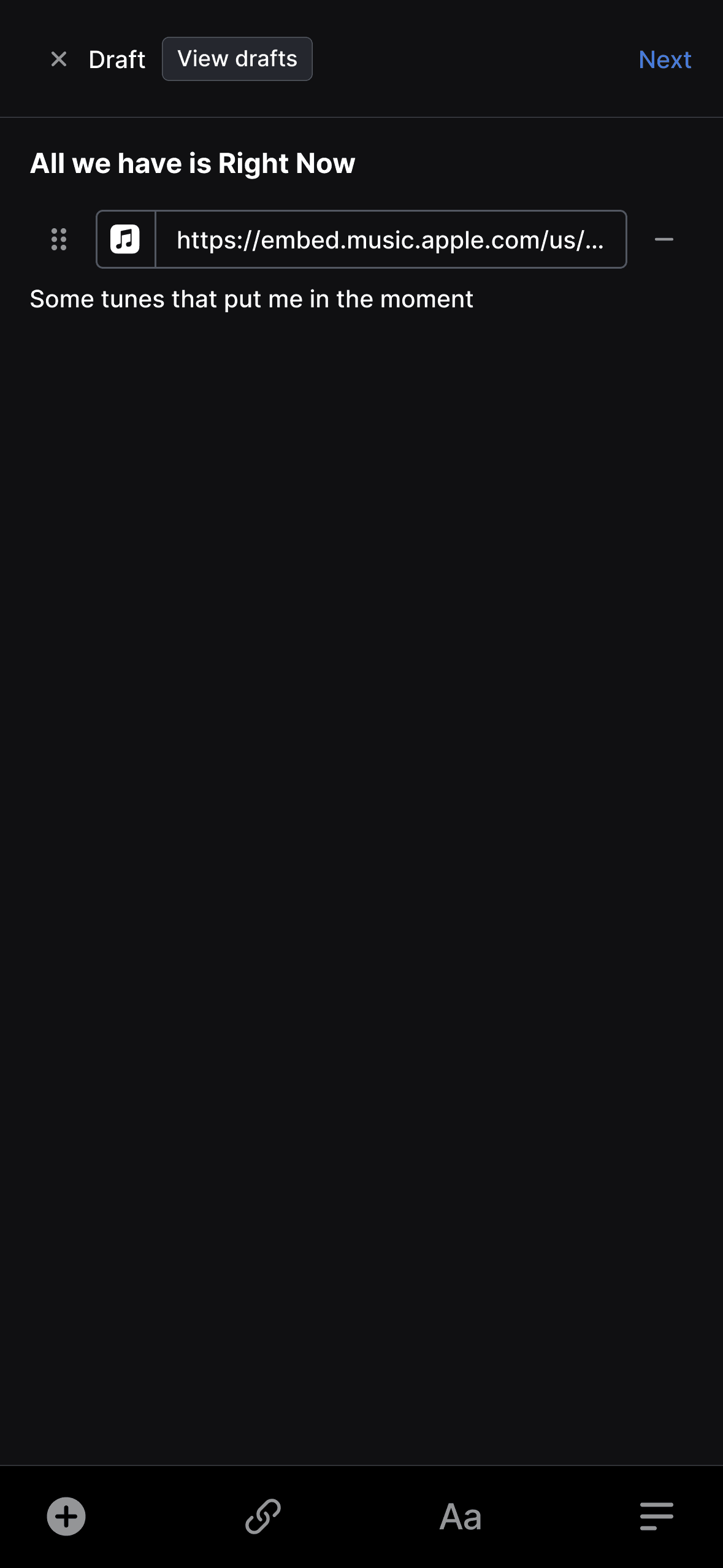
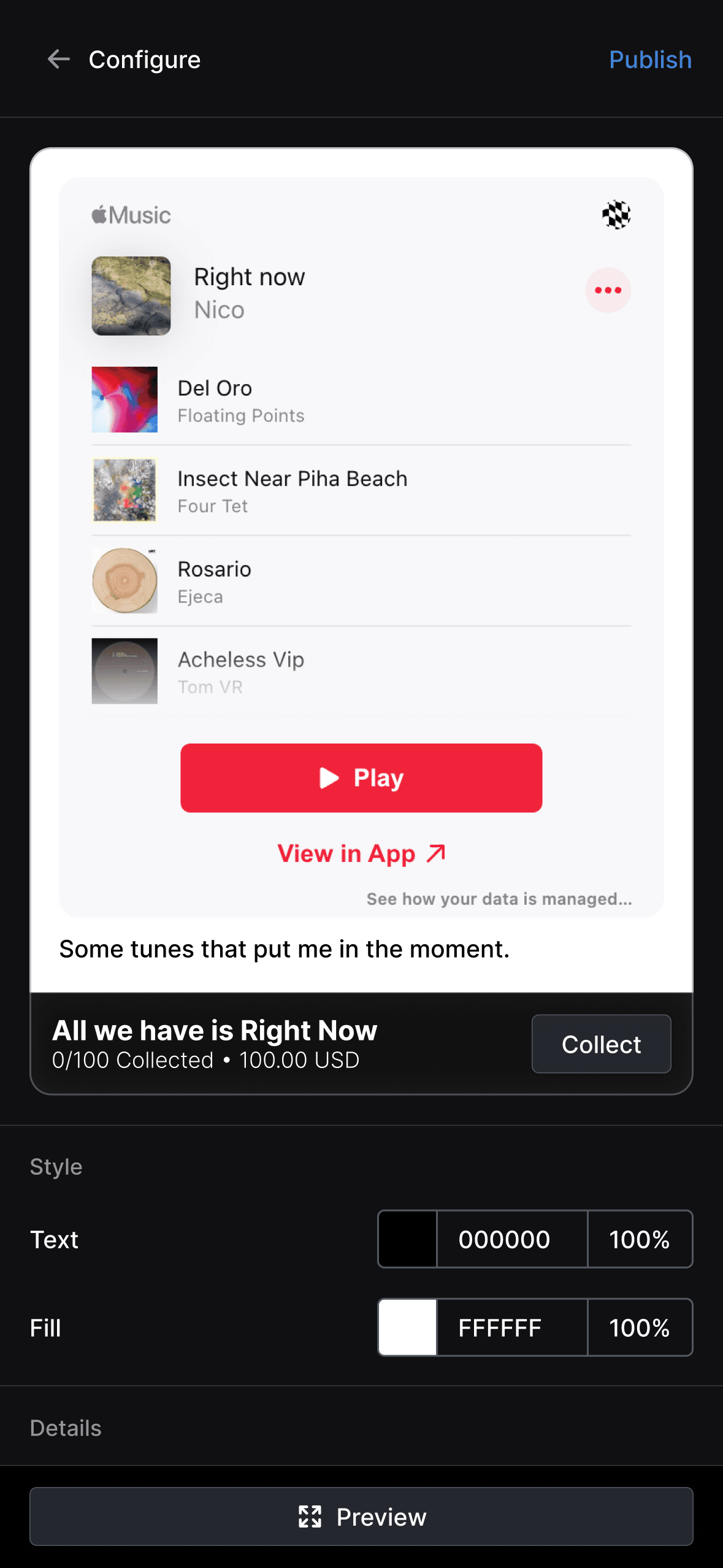
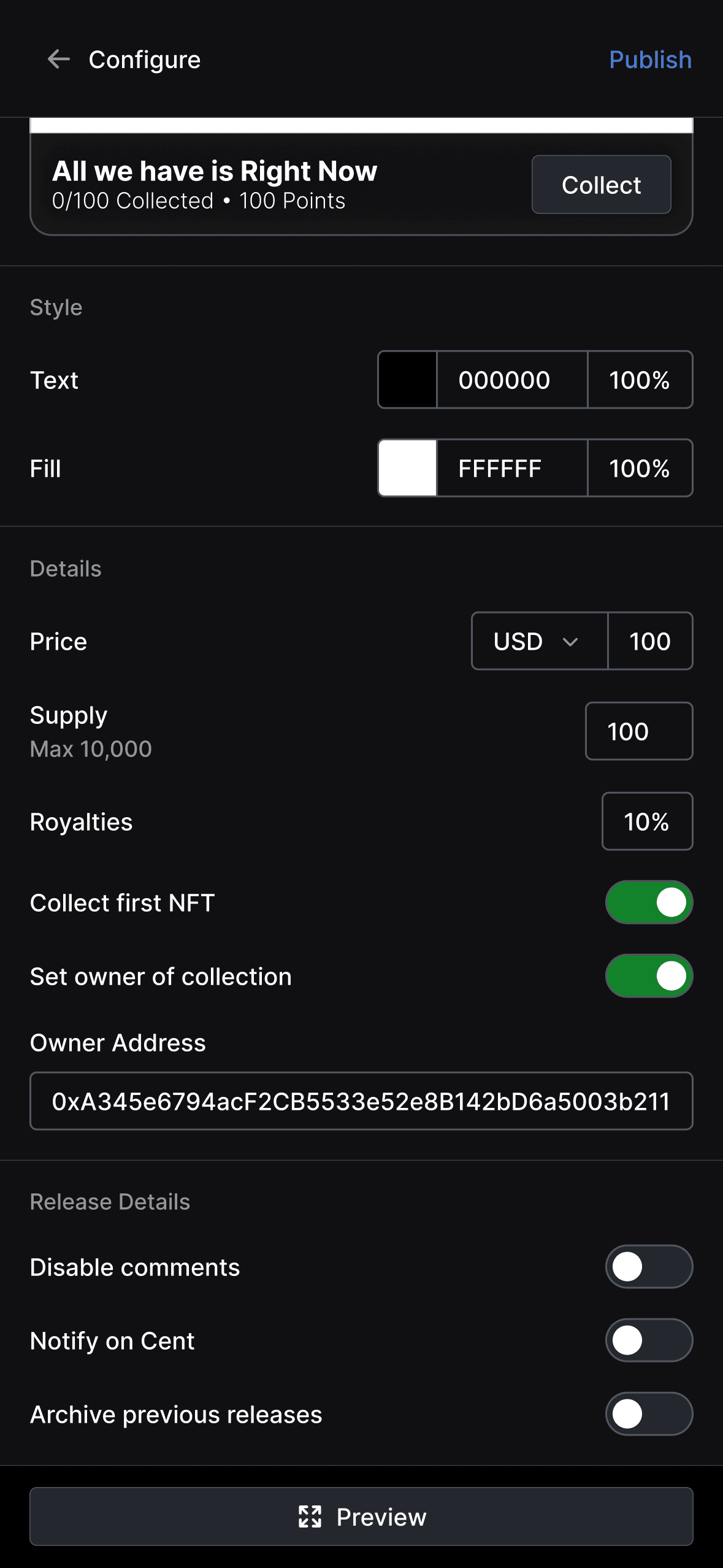
I divided the post creation process into two distinct steps: "Draft" and "Configure", to concentrate the UI on the specific actions required by each phase. The "Draft" view focuses on creating the post content. The "Configure" view presents options for customizing the post styling as well as adjusting the NFT and release details, such as the price, supply, and whether the first edition of the post is automatically collected by the creator.
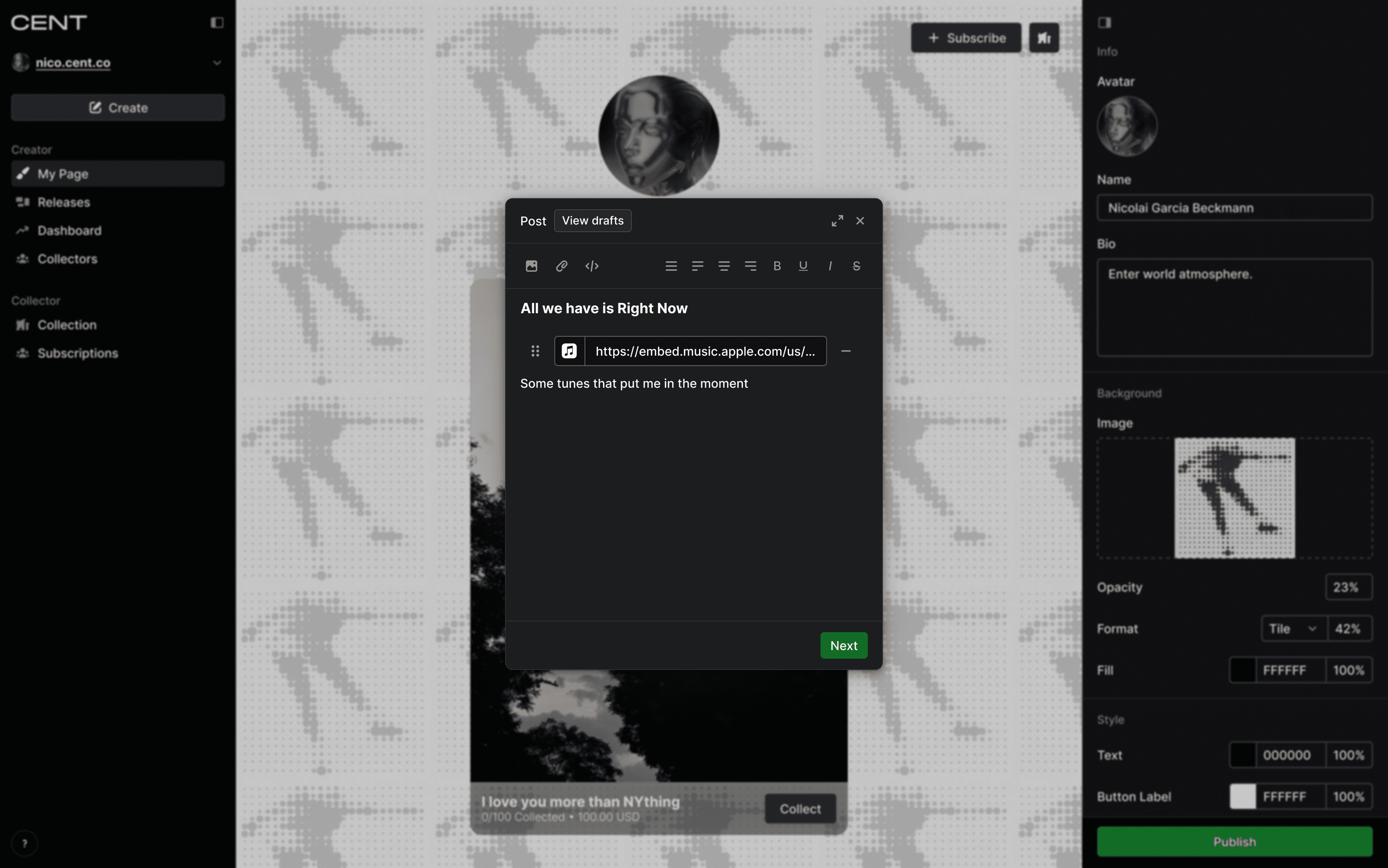
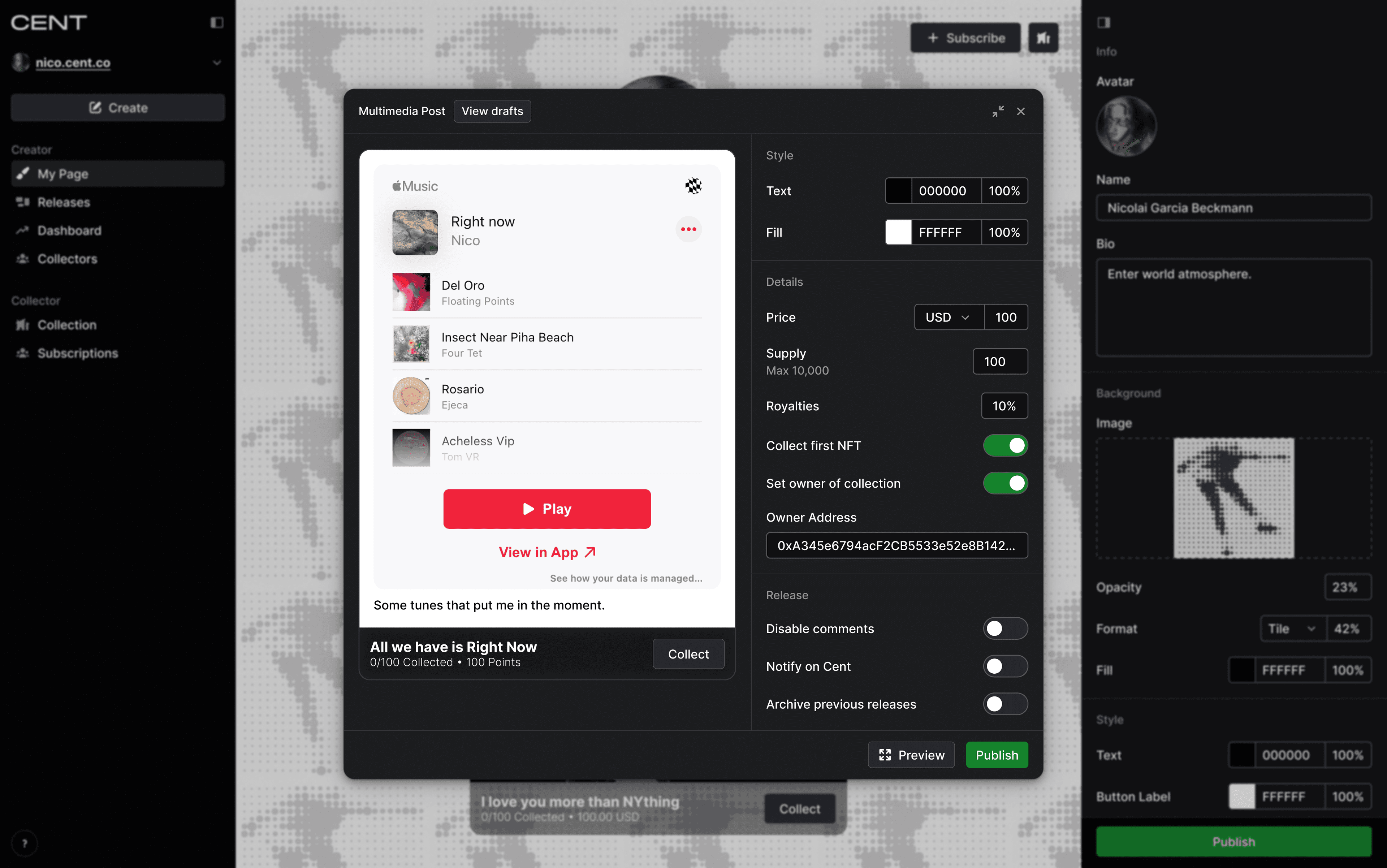
Multimedia
The multimedia post can include text, images, and embeds (Apple Music, Spotify, YouTube, Soundcloud). I built the rich text editor on top of the Plate library which exposes a helpful API for crafting block content.
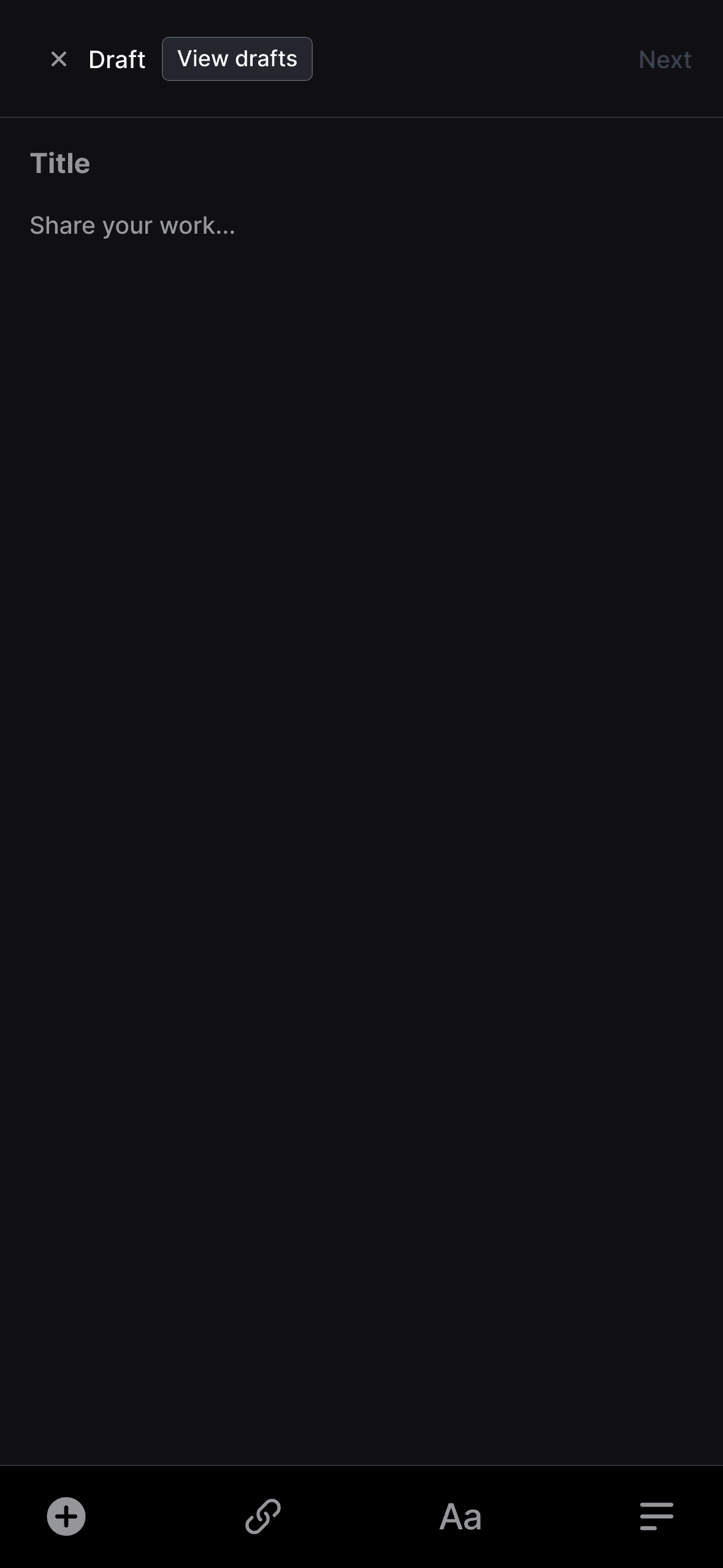
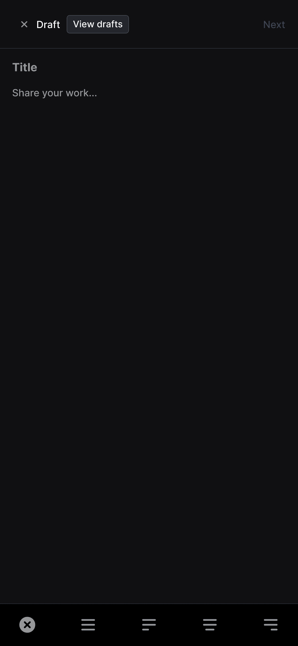
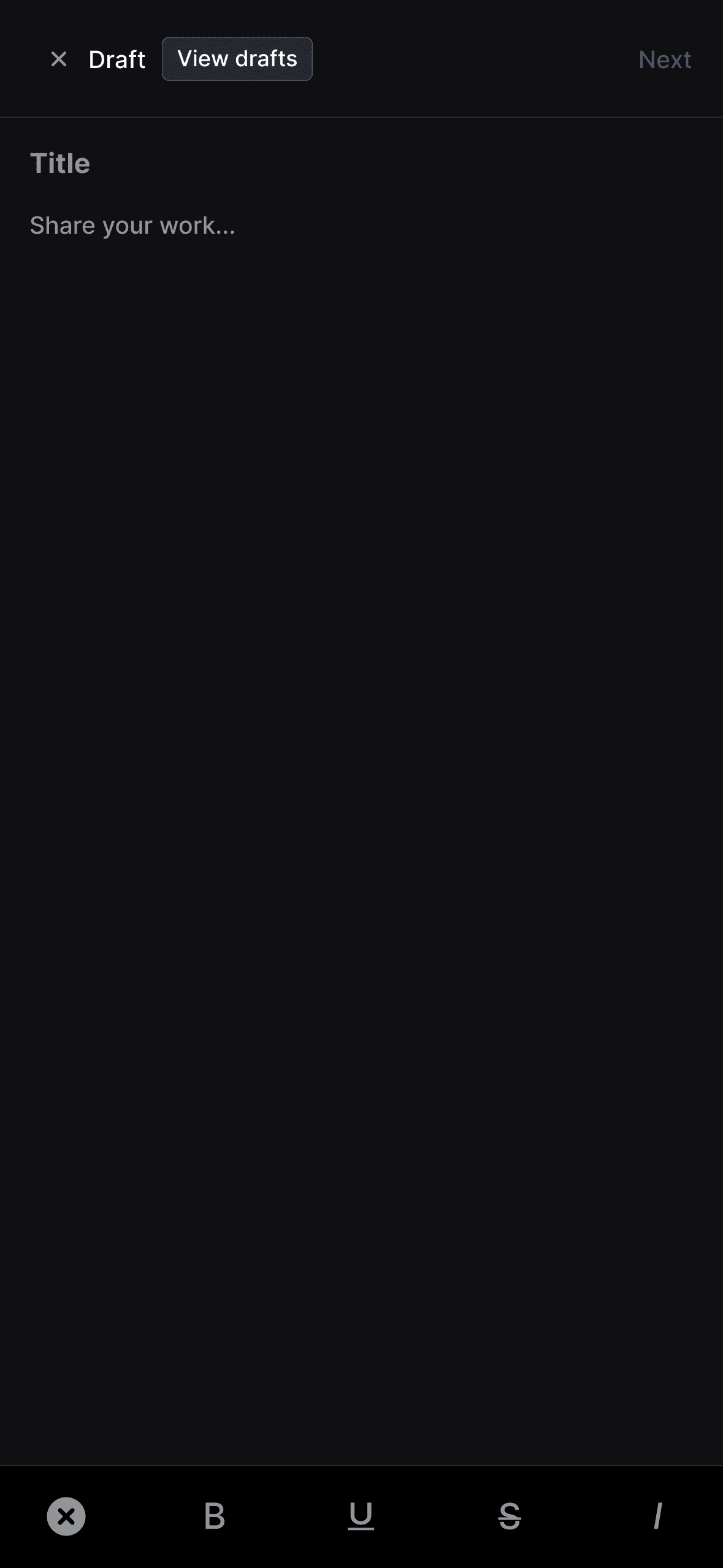
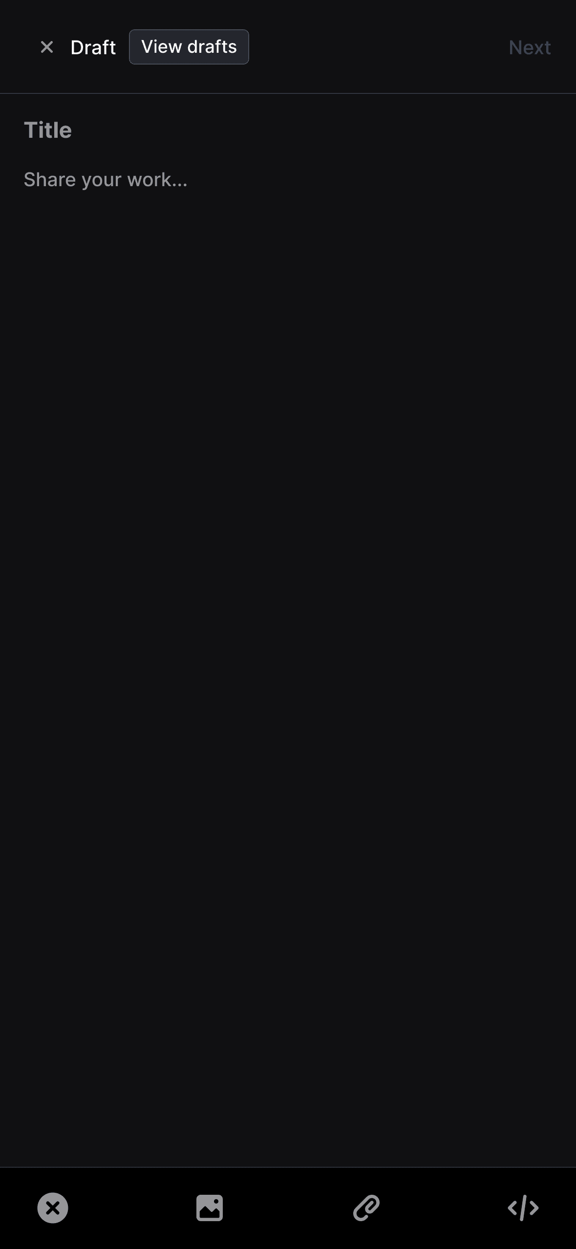
There are significant differences between the desktop and mobile versions of the Create Post UI that align with the standard patterns for both. I wanted to keep the text formatting bar and "Next" action on opposite sides of the rich text editor to prevent inaccurate clicks or taps on the formatting bar from navigating away from the drafting interface. On mobile, the formatting bar is located on the bottom of the editor to be close to the user's thumbs and the "Next" action displays on the right side of the page header which follows standard mobile UI patterns. This is reversed on desktop where the "Next" action displays as the dialog's primary CTA whereas the formatting bar sits above the text.
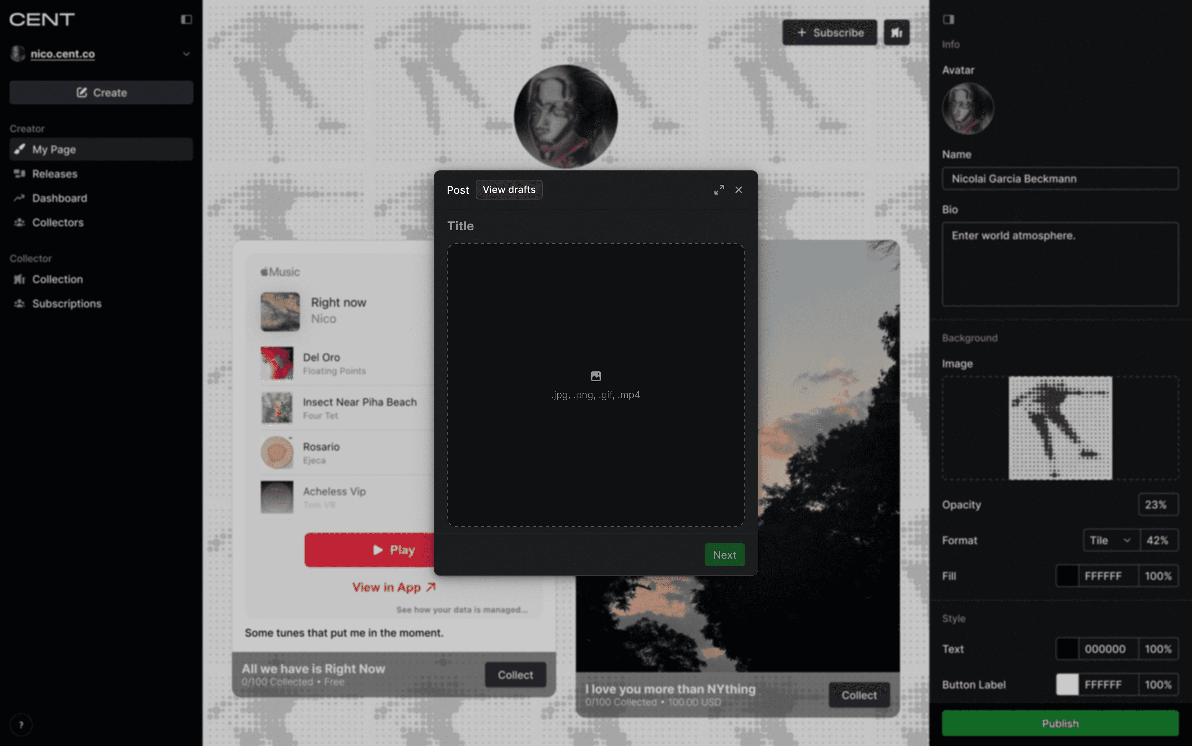
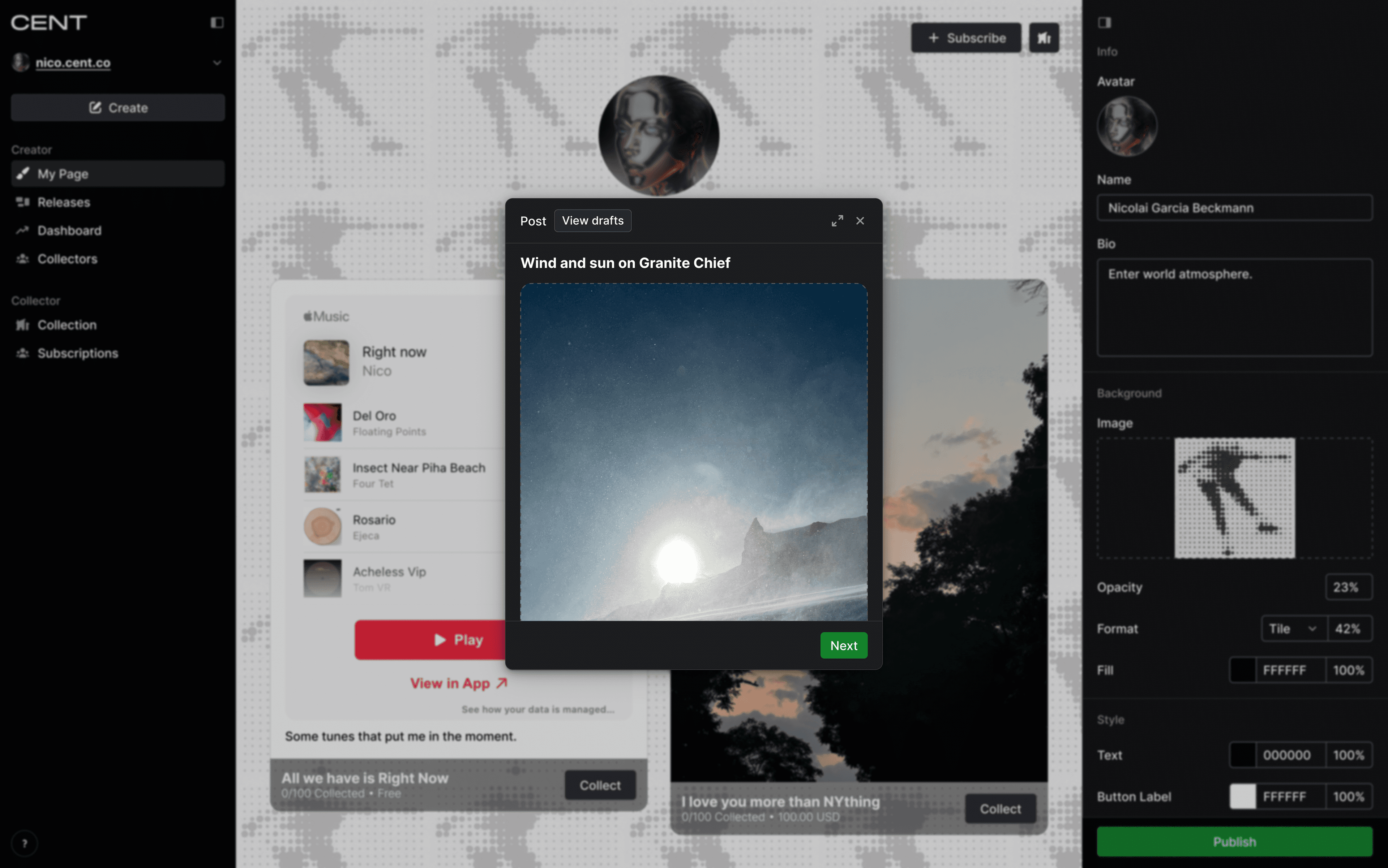
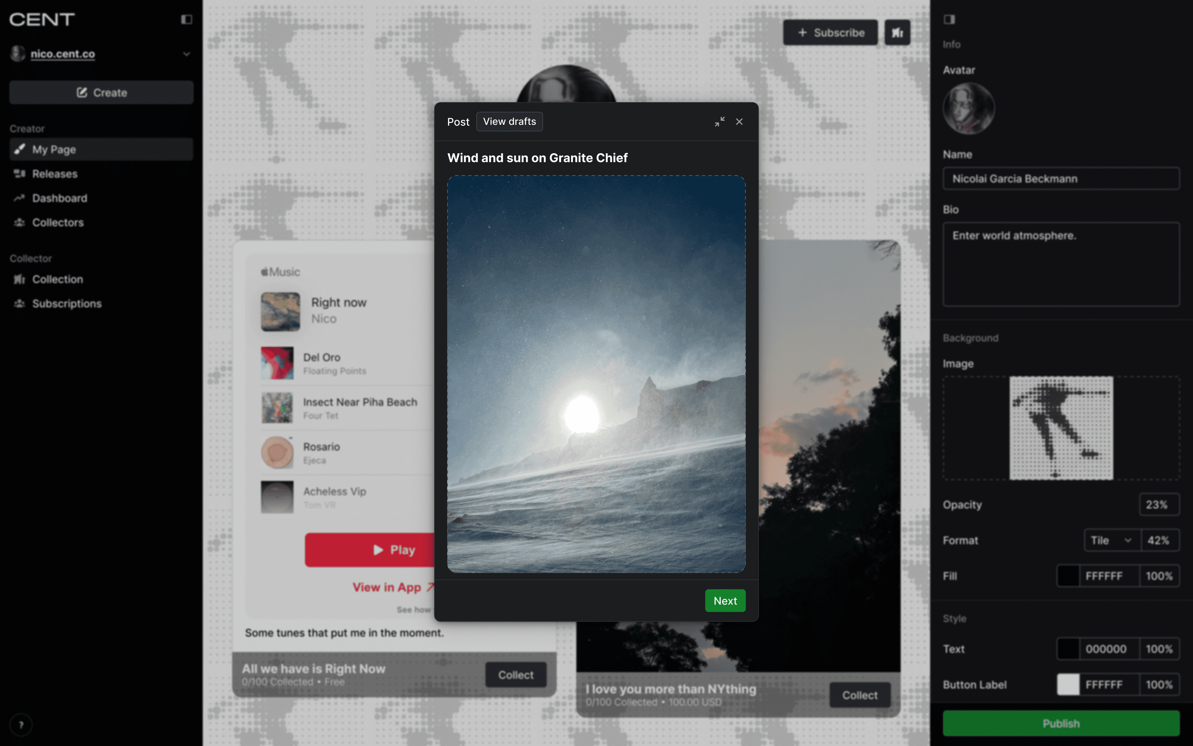
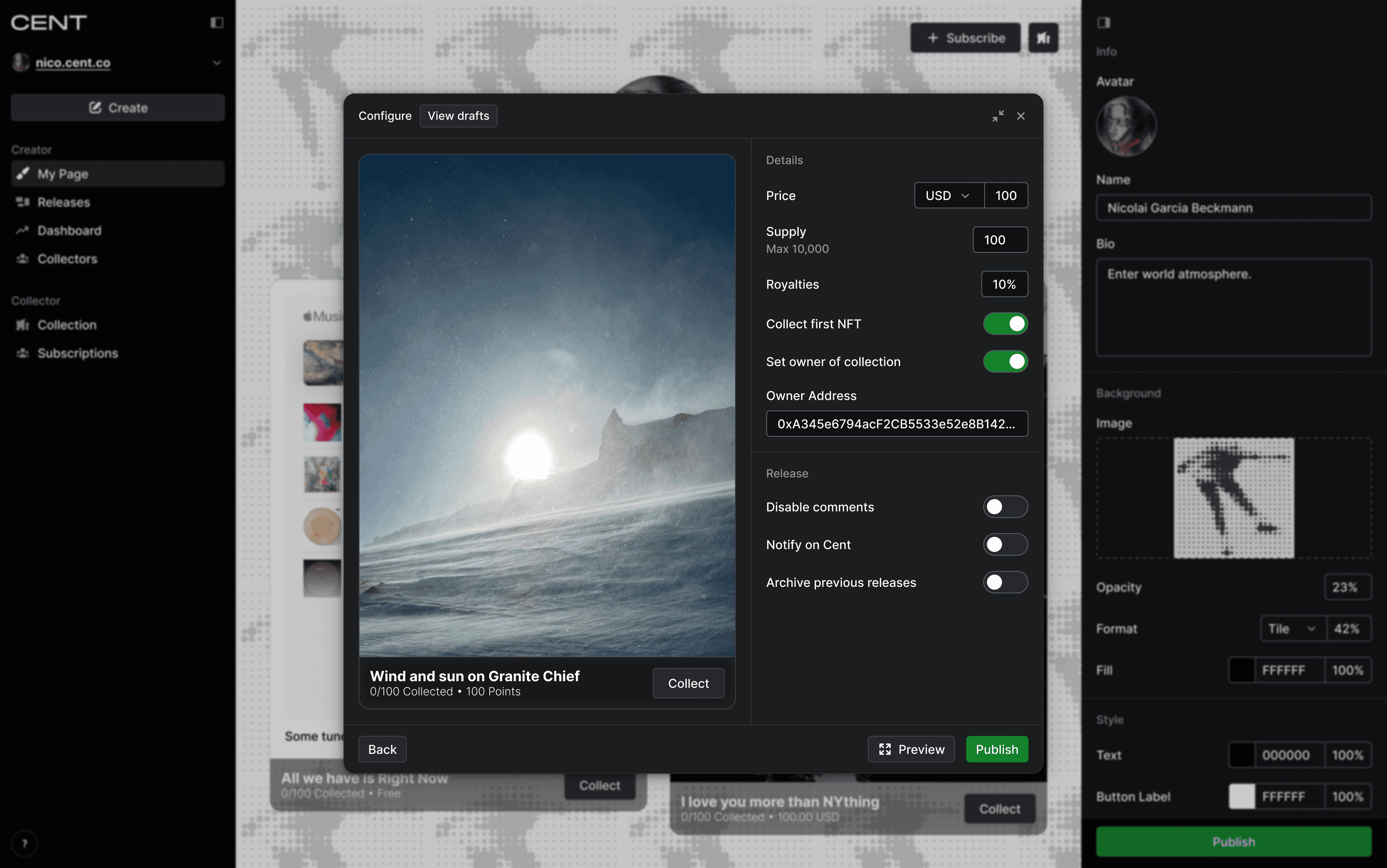
Image or Video
At first we only supported the creation of multimedia posts but soon realized that many creators wanted to post only a single image or video. In order to give creators the opportunity to present their visual work more cleanly, we added a second visual-only type of post where the content took up all available space in the post content.